How To Tell If A Feature Has Predictive Information
Time to read:
15min
This article picks up where the previous one left off. If you have not read the antecedent article on feature engineering for directional trading strategies, start here: https://x.com/structure_fi/status/2052780472233603141
In the last post, we built features from raw market data. We took noisy tick streams, applied causal kernels, and turned price, volume, spread, and order-flow series into cleaner measurements.
That is the right starting point, but it is only the starting point.
A feature can be intuitive, well constructed, and easy to explain, yet still have no useful relationship with the thing you are trying to predict. This is one of the first painful lessons in systematic trading. A good story about why a feature should work is not evidence that it does work.
The actual question is narrower: does this feature contain information about the future return target?
That means the target you defined before the feature was built. Not the past return. Not the current market state. Not something accidentally leaked from the future. The real future return horizon you intend to model and eventually trade.
This is where a lot of research starts to drift. People build feature after feature, run larger models, and keep adding complexity before checking whether the raw relationship is there at all. The basic question should come much earlier: when this feature changes, does the future return distribution change in a way that is measurable, stable, and eventually tradable?
The first test is simple: conditional behavior.
Before model training, before feature importance, before discussion of sophisticated algorithms, look at what tends to happen next when the feature is high, low, or somewhere in the middle.
Start With Conditional Behavior
The first smell test is a bucket plot.
Take your feature values at decision time, sort them into quantiles, and measure the future returns that followed each bucket.
For example, suppose you built a smooth differential feature on mid-price. At every decision time, you have a feature value x_t and a future return target r_{t,h} over horizon h. Sort x_t into buckets, then ask what the future return looked like in each bucket.
If the feature has directional information, the buckets should show some kind of structure. The cleanest version is monotonicity: the lowest feature bucket has the weakest future returns, the next bucket is better, the middle is close to neutral, and the highest bucket is strongest. In that case, the feature behaves like a ranking signal. Higher feature values correspond to higher expected future returns, and lower feature values correspond to lower expected future returns.
That clean monotonic shape is nice when you find it, but most real features are less tidy.
Sometimes the relationship is convex. The feature only matters in the tails, while the middle buckets are mostly noise. That can happen with volatility, order-flow imbalance, spread widening, liquidation flow, or other stress-like variables.
Sometimes the relationship is one-sided. Very negative values may predict downside, while positive values do not predict upside. Or the reverse. That can still be useful, but only if you notice the asymmetry and model it honestly.
Sometimes the feature separates regimes rather than average returns. The mean return may not look impressive, but the distribution changes. One bucket may have much higher volatility. Another may have worse downside skew. Another may have many small wins and rare large losses. If you only look at average return, you can miss the thing the feature is actually telling you.
This is why the bucket plot should not only show average future return. At minimum, look at the mean, median, hit rate, volatility, downside tail, and observation count by bucket.
The last one matters more than people think. If the top bucket has 12 observations, the plot is not evidence yet. It is a story that needs more data.
The bucket test is not proof. A good bucket plot does not mean the feature will survive out of sample, trade after costs, or add value once it is combined with the rest of your model. It only tells you that the feature is worth taking more seriously.
A bad bucket plot is useful too. If the buckets are flat, unstable, or obviously dominated by a few observations, the feature may not be connected to the target in a simple way. The chosen horizon may be wrong. The feature may need to be transformed, clipped, normalized, interacted with another variable, or thrown away.
This is a good place to be ruthless. Most features should die here. The point is not to defend every idea. The point is to find the few features that deserve more expensive tests.
Example: A Feature With Structure
Here is a synthetic example where the feature has real directional information.
Each dot is one observation. The x-axis is the feature bucket, sorted from lowest feature values on the left to highest feature values on the right. The y-axis is the future return target in basis points. The teal line is the bucket mean, and the orange line is the bucket median.
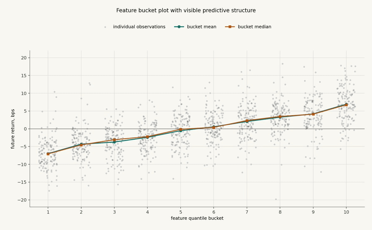
This is the kind of first-pass picture that should make you keep going.
The individual observations are still noisy. That is normal. If every dot lined up neatly, the example would be fake in a different way. What matters is that the conditional distribution shifts as the feature bucket changes.
The lower buckets are centered below zero. The middle buckets are closer to neutral. The higher buckets are centered above zero. The relationship is not perfectly linear, but the direction is clear enough to justify more work.
At this stage, the conclusion is modest: the feature has passed the first smell test. The next questions would be whether this relationship survives through time, whether it survives out of sample, whether it remains after costs, and whether it adds value beyond other features.
Example: A Feature With No Obvious Relationship
Now compare that with a synthetic feature that has no real relationship with the target.
The plot has the same number of observations, the same bucket construction, and the same future-return scale. The feature values are sorted into buckets exactly the same way. The only difference is that the feature is not connected to the future return process.
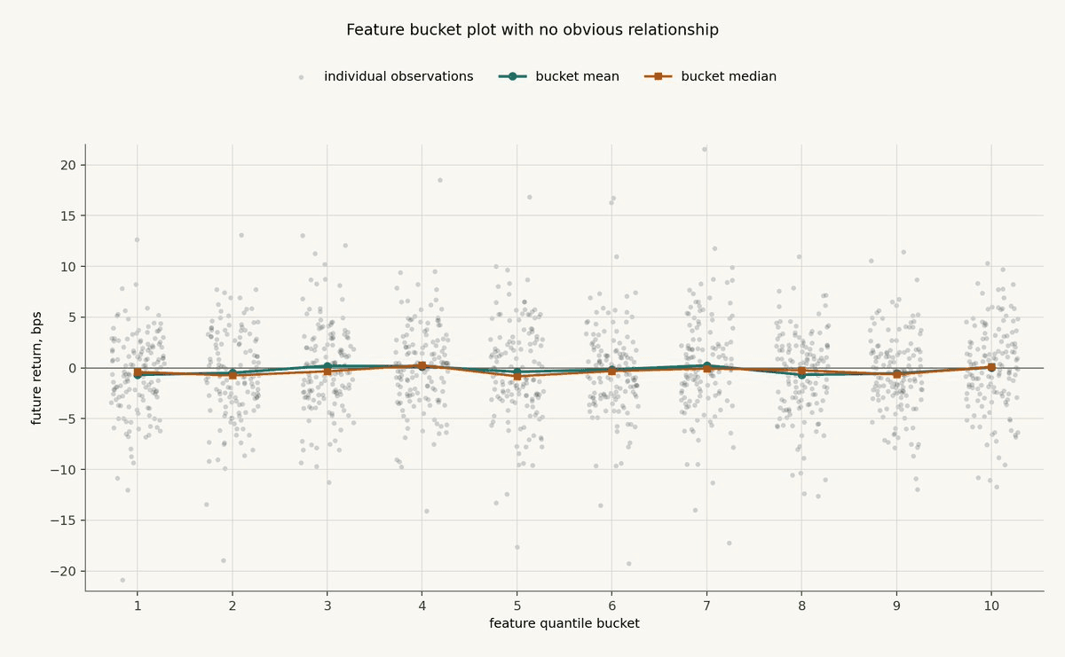
This is what dead features often look like.
There are plenty of dots. Some returns are large. Some buckets have outliers. If you wanted to tell yourself a story, you could probably find one.
But the bucket means and medians are basically flat. There is no monotonic relationship, no obvious tail behavior, and no clear regime separation. The feature may still interact with something else, or it may become useful after a different transformation, but the simple unconditional relationship is not there.
That is a useful result. It tells you not to spend the next week building a complicated model around this feature unless you have a specific reason to believe the bucket test is missing the relevant structure.
Measure Linear And Rank Information
Bucket plots are visual. They help you see the shape of the relationship.
The next step is to compress that relationship into a few simple numbers.
The most common number is the information coefficient, usually called IC. In this context, IC is just the correlation between the feature observed at decision time and the future return target.
If x_t is the feature and r_{t,h} is the future return over horizon h, the basic IC is:
This is usually a Pearson correlation. It asks whether the feature and the future return move together in a roughly linear way.
A positive IC means higher feature values tend to be followed by higher future returns. A negative IC means higher feature values tend to be followed by lower future returns. An IC near zero means the feature does not have a simple linear relationship with the target.
In trading research, useful IC values are often small. That is not automatically bad. Future returns are noisy, especially at short horizons. A feature with a small but stable IC can be more useful than a feature with a large IC that appears once and then disappears.
But Pearson IC has a weakness: it can be too sensitive to outliers and too focused on linear relationships.
That is why you also want rank IC.
Rank IC computes the correlation between the ranks of the feature and the ranks of the future return:
This is usually a Spearman correlation. It asks a slightly different question: does the feature rank observations in the right order?
Rank IC is often more useful than raw Pearson IC when the relationship is monotonic but not linear. If the highest feature bucket tends to have better future returns than the middle bucket, and the middle bucket tends to have better future returns than the lowest bucket, rank IC will usually see that structure even if the exact spacing is uneven.
This connects directly back to the bucket plot.
The bucket plot shows you the shape. IC and rank IC give you compact measurements of that shape.
Neither number is enough by itself.
A feature can have a decent Pearson IC because of a few extreme observations. A feature can have a decent rank IC while still being too weak, too unstable, or too expensive to trade. These statistics are screening tools, not verdicts.
The next question is whether the relationship is stable through time.
To test that, compute rolling IC.
The common version uses a fixed rolling window. For example, compute IC over the most recent 30 days, roll forward one day, and compute it again.
That works, but it has the same hard-edge problem as a classical moving average. The observation just inside the window gets full weight. The observation just outside the window gets zero. In market data, that cutoff is often arbitrary.
A cleaner version is to compute a smooth rolling IC using the same kind of causal operators from the previous post.
Think of IC as a rolling correlation. To estimate a rolling correlation, you need rolling estimates of five quantities:
feature mean
target mean
feature variance
target variance
feature-target covariance
Each of those can be estimated with a causal EMA or a smoother moving-average kernel.
For a feature x_t and future return target r_{t,h}, define smooth averages:
Here, tau is the smoothing time scale of the causal operator. It is a practitioner-chosen parameter: shorter tau means the estimate reacts faster but is noisier, while longer tau means the estimate has more memory but adapts more slowly.
Then estimate variance and covariance with the same smoothing operator:
The smooth rolling IC is then:
This gives you a time series of local IC estimates without a hard window boundary.
The same idea works for rank IC. Instead of applying the calculation to raw x_t and r_{t,h}, first transform them into ranks or percentile scores over a local causal window, then compute the same smooth correlation on those rank-transformed series.
In practice, a useful approximation is to convert each observation into a rolling percentile score:
Then compute smooth rolling correlation between u_x(t) and u_r(t):
This is the operator mindset again.
You are not limited to rectangular windows. You can use an EMA, the smoother Simple Moving Average kernel from the previous post, or another causal weighting scheme that matches the memory you care about.
The half-life or window scale matters. A very short IC operator will be noisy and reactive. A very long operator will be stable but slow to notice regime changes. The right choice depends on how quickly you expect the feature's relationship with the target to change.
The output is a time series of IC values. If the feature has a stable positive IC across many different market environments, it is more interesting. If the IC is strongly positive in one period, flat in the next, and strongly negative after that, the feature may be regime-dependent, overfit, or measuring something less durable than you thought.
Smooth rolling IC also helps separate a real feature from a lucky full-sample result. One impressive full-sample IC can come from one large event or one favorable regime. A rolling IC plot makes that much harder to hide.
Here is a synthetic example.
The top panel shows the latent relationship between a feature and the future return target. The relationship starts positive, fades, turns negative, and then recovers. The bottom panel shows smooth rolling Pearson IC and smooth rolling rank IC, both computed with a 120 observation half-life.
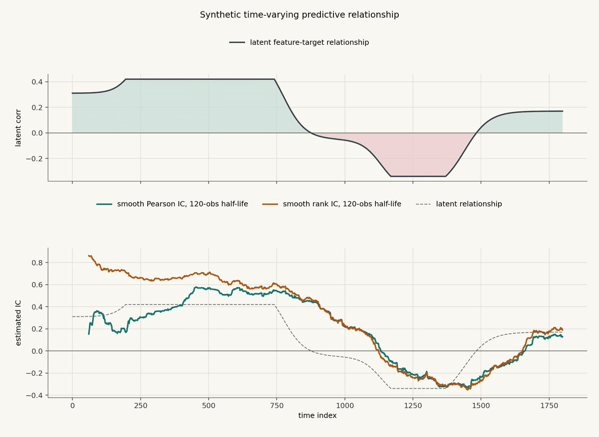
The estimates do not jump instantly when the latent relationship changes. That lag is the cost of smoothing. The benefit is that the IC series is less dominated by individual noisy observations.
This is the same tradeoff as every causal operator in the previous post. A shorter tau would react faster but look noisier. A longer tau would be smoother but slower to notice the relationship changing.
The useful thing is not that the estimate is perfect. It is that you can see the feature's relationship with the target evolve through time. A single full-sample IC would hide most of this behavior.
Finally, measure IC decay across horizons.
Take the same feature and compute its IC against future returns over different horizons: 10s, 30s, 1m, 5m, 15m, 1h, or whatever horizons make sense for the strategy.
The result is an IC decay curve.
If a feature is genuinely capturing short-term pressure, the IC may be strongest at short horizons and fade as the horizon gets longer. If a feature is capturing a slower regime effect, the IC may be weak at 10s and stronger at 15m or 1h.
This matters because a feature should be tested against the horizon it is meant to inform.
A market microstructure feature that predicts the next few seconds may look useless against a one-day return. A slow regime feature may look useless against the next tick. The feature is not necessarily bad. The test may be pointed at the wrong horizon.
After the bucket plot, the basic measurement stack is Pearson IC, rank IC, rolling IC through time, and IC decay across forecast horizons.
If the feature has no structure in the bucket plot, no meaningful IC, no rank IC, no rolling stability, and no sensible horizon decay, you probably do not have a feature yet.
Look For Nonlinear Dependence
Pearson IC and rank IC are useful, but they are not the whole story. Some features are predictive in ways that do not show up as a clean linear or monotonic relationship.
A U-shaped feature can matter in both tails while looking close to zero under Pearson IC. A threshold feature can do nothing most of the time, then matter a lot once spread, volume, imbalance, or volatility crosses a critical level. If you only look at correlation, you can miss both.
The first tool is still the bucket plot.
For bucket q, define the observations whose feature values fall into that quantile bucket:
Then measure the conditional mean future return inside the bucket:
You can do the same with medians, hit rates, downside quantiles, or volatility. The point is to see the conditional shape directly.
The chart below compares two synthetic examples. The left panel is a true nonlinear U-shaped relationship: low and high feature values both matter, while the middle is less useful. The right panel is more dangerous. It shows a clean-looking bucket slope created by slow drift and an unstable relationship through time.
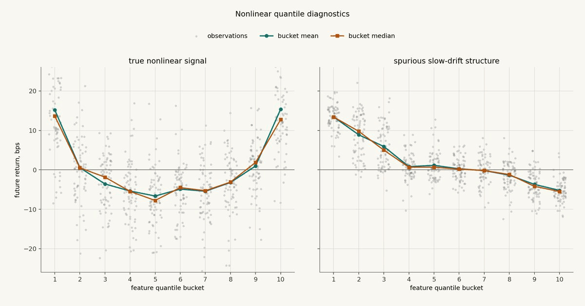
This is the first useful split. In the left panel, the feature contains information in the tails, and a linear IC would miss a lot of it. The right panel is intentionally tempting: it looks directional, but the structure is coming from persistent regimes moving through time. That is why the next diagnostics need time-aware nulls and out-of-sample tests.
Mutual information is a more general diagnostic.
It asks whether knowing the feature reduces uncertainty about the target. In a binned version, if p_{ij} is the joint probability of feature bin i and target bin j, and p_i and p_j are the marginal probabilities, mutual information is:
If the feature and target are independent, then p_{ij} should be close to p_i p_j, and mutual information should be near zero. If the joint distribution has structure, mutual information rises.
But the number is hard to interpret by itself. A mutual information value of 0.25 is not obviously good or bad until you compare it against what you would expect from noise.
That is what the next chart does.
The tall green vertical line, labeled observed, is the mutual information measured on the real aligned sample: the feature value x_t paired with the future return r_{t,h} that actually followed it.
The histograms are null distributions. A null distribution answers the question: what mutual information would we usually see if there were no usable feature-target relationship, but the data still had the same rough marginal distributions?
The gray null comes from naive row shuffling. We randomly shuffle the future returns across individual rows, recompute mutual information, and repeat that many times. This breaks the alignment between feature and target, but it also destroys time structure.
The tan null comes from blocked permutation. Instead of shuffling individual rows, we shuffle contiguous blocks of time. This still breaks the exact alignment, but it preserves more of the slow regime behavior, autocorrelation, volatility clustering, and repeated market state that show up in financial data.
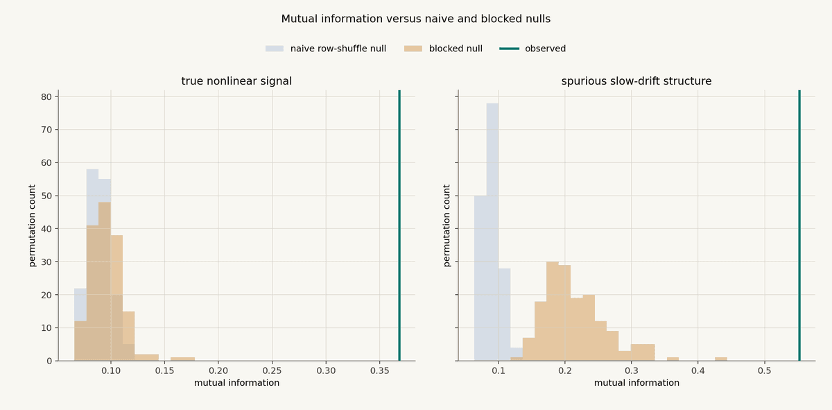
In the true nonlinear example, the green observed line is far to the right of both null histograms. That is what an interesting diagnostic looks like: the feature-target relationship is stronger than what we usually get after breaking the alignment.
In the slow-drift example, the naive row-shuffle null is too easy to beat. It destroys the time structure, so the observed statistic looks much more impressive than it should. The blocked null is wider because it preserves more of the slow time-series behavior. The observed statistic still lights up, but the interpretation changes. The evidence is not "we have hundreds of independent confirmations." It is closer to "we may be looking at a small number of persistent regimes."
Distance correlation is another way to look for nonlinear dependence.
Start with pairwise distances:
Then double-center the distance matrices:
And do the same thing for the target-distance matrix:
The distance covariance is:
And distance correlation normalizes it:
Ordinary correlation can miss nonlinear relationships. Distance correlation is designed to react to broader dependence in the joint distribution.
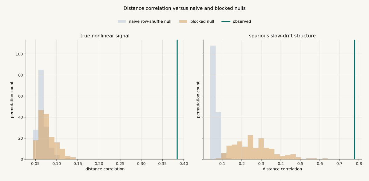
The interpretation is similar to mutual information. In the true nonlinear example, the observed statistic is far outside both nulls. In the slow-drift example, the blocked null is much more demanding than the naive null. The observed value can still sit outside it, because there really is dependence in the sample. But dependence is not the same thing as a stable forecasting relationship. Financial data is not a bag of independent rows, and diagnostics that ignore time structure will often overstate the evidence.
Model-based tests are often the most practical nonlinear check.
Instead of asking whether a statistic is large, ask whether a model using the feature predicts the target better than a baseline model out of sample.
Let M_0 be a baseline model and M_1 be a model that uses the nonlinear feature transformation. If L_0 and L_1 are out-of-sample losses, define loss improvement as:
Positive values mean the feature model reduced out-of-sample loss. Negative values mean it made prediction worse.
In the synthetic example below, M_0 is an intercept-only baseline and M_1 is a simple polynomial model using the feature. The statistic is computed with a forward time split, then compared against naive and blocked nulls.
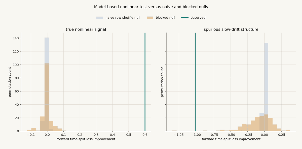
The true nonlinear example is clean: the model using the nonlinear feature reduces out-of-sample loss by a lot, and the improvement is far away from the null distributions.
The slow-drift example is different. The diagnostic does not show a useful forward out-of-sample improvement. It is actively bad. Even though the earlier distributional diagnostics saw dependence, the model test is asking a harder question: can this feature learned from the earlier period help predict the later period? In this case, the answer is no.
That contrast is important.
Mutual information and distance correlation are good at detecting dependence. They do not know whether the dependence is stable, tradable, or useful out of sample. A model-based test is closer to the real research question, but it can overfit too if the validation design is weak.
The main rule is simple: nonlinear dependence tests are research tools, not magic detectors. Use them to find candidate structure, then make that structure survive the same discipline as everything else.
Test Incremental Predictive Value
The real question is not "does this feature correlate with returns?"
The real question is: does this feature improve the model beyond what we already have?
That distinction matters because most useful-looking features are at least partly redundant. A new order-flow feature may mostly repeat what your existing momentum feature already knows. A volatility feature may look predictive by itself, but add nothing once spread, volume, and recent returns are already in the model. A regime feature may have a beautiful bucket plot and still fail because the baseline model already captures the same regime.
So the test should be comparative.
Start with the model you already believe in. Call its input set z_t. That might include existing features, normalizations, regime variables, or whatever the current research baseline uses. Train the baseline model:
Then train the same class of model with the new feature x_t added:
Evaluate both models on the same held-out periods, using the same target, the same timestamps, the same sample weights, and the same validation scheme.
If L is the out-of-sample prediction loss, the incremental value is:
Positive Delta_inc means the new feature reduced out-of-sample loss. Negative Delta_inc means the model got worse after adding it.
This is a much harder test than standalone IC.
A standalone IC asks whether x_t knows anything about r_{t,h}.
Incremental predictive value asks whether x_t knows anything that the rest of the model does not already know.
That is the test that matters in a real strategy pipeline.
There is also a useful residual version of the same idea. First fit the baseline model and compute its prediction error:
Then ask whether the new feature explains that residual. If x_t only predicts the part of returns already captured by M_0, it is probably redundant. If x_t predicts the residual, it may be adding genuinely new information.
In practice, this does not mean the new feature needs to improve every metric in every period. Markets are noisy. A real feature can have weak periods. But the improvement should be visible under honest validation:
forward time splits, not random row splits
blocked cross-validation, not shuffled rows
the same preprocessing fit only on training data
the same feature selection rules applied without peeking
enough samples that one event is not driving the result
Forward time splits means the model is trained on earlier observations and tested on later observations. That is how live trading works. You learn from the past, then trade the future. A random row split breaks that discipline. It mixes earlier and later rows together, which lets the training set contain examples from regimes that occur after the test rows. In market data, neighboring observations are not independent. They share volatility, liquidity, positioning, flow, and venue conditions. Random splits can make a feature look stable because the model has already seen pieces of the same future environment during training.
The same idea applies to preprocessing. If you normalize, winsorize, standardize, bucket, impute, neutralize, or select features, fit those transformations only on the training period. Then apply the learned transformation unchanged to the validation or test period. For example, if you z-score a feature, estimate the mean and standard deviation on the training set only. If you compute bucket edges, compute them on the training set only. If you choose clipping thresholds, choose them on the training set only. If you use the full dataset to choose those values, the future has already influenced the research process, even if the model never directly sees the future return label.
You should also check whether the improvement is concentrated in a way that makes sense. If the new feature only helps during high-spread regimes, that might be useful. If it only helps during one week in the training set, that is a warning. If it improves prediction but creates much higher turnover, the predictive gain may not survive execution costs.
The cleanest outcome looks like this: the baseline model is already decent, the new feature improves out-of-sample loss, the improvement survives blocked or time-aware resampling, and the periods where it helps line up with the economic reason the feature was built.
The bad outcome is also useful: the feature has a nice standalone plot, a decent IC, maybe even some nonlinear dependence, but it adds nothing to the baseline. That is not a failure of the test. That is the test saving you from carrying dead weight into the strategy.
A feature earns its place only when it contributes incremental information. If it doesn't and include it anyway, you are over-fitting and biasing your goodness of fit measurements.
Use Forecast-Comparison Tests
Once you have two models producing out-of-sample forecasts, compare the forecast errors directly.
This is the clean version of the question. You are no longer asking whether a feature looks predictive in isolation. You are asking whether the model that uses it produces better forecasts than the model that does not.
Suppose the baseline model produces forecast rhat_0 and the new model produces forecast rhat_1. The realized future return is r_{t,h}. The forecast errors are:
Choose a loss function that matches the research question. Mean squared error is common if you care about calibrated return forecasts. Absolute error can be more robust to outliers. A directional loss can be useful if the model is mainly used for ranking long versus short pressure. A trading-oriented loss can include turnover, slippage, fees, and position constraints, but then you need to be honest about execution assumptions.
For each out-of-sample timestamp, compute the loss differential:
If d_t is positive, the new model had lower loss at time t. If it is negative, the baseline model was better.
The average loss differential is:
A positive average loss differential means the new model won on average. But the average is not enough. You also need to know whether the win is large relative to the noise in the loss differential series.
This is where Diebold-Mariano style tests are useful.
The Diebold-Mariano test is a test of equal predictive accuracy. In plain English, the null hypothesis is: the two models have the same expected out-of-sample loss.
The alternative is that one model has lower expected loss:
The basic statistic looks like:
The denominator is the important part. Forecast loss differentials in market data are usually serially correlated. If the return horizon overlaps, this is almost guaranteed. A 5m future return computed every second shares most of its price path with the next 5m future return. Volatility regimes and liquidity regimes also make neighboring forecast errors related.
So do not treat the d_t values as independent rows. Use a HAC estimator, which means a heteroskedasticity- and autocorrelation-consistent variance estimate, a Newey-West style correction, or a block/bootstrap version of the test so the variance estimate respects time dependence. Otherwise the test will usually be too confident.
If the new model has a better average loss but the forecast-comparison test says the difference is not meaningful, the feature is still a maybe. If the improvement survives a time-aware test, it has made it through a much more serious filter. If it only wins in sample or under random splits, assume overfit until proven otherwise.
When comparing one baseline against one challenger, Diebold-Mariano is the classic tool. The problem changes when you are comparing many candidates.
In real research, you rarely test one feature. You test dozens or hundreds: different kernels, half-lives, normalizations, horizons, buckets, interactions, and model classes. If you test enough candidates, one will look good by luck. This is data snooping.
SPA-style tests and Model Confidence Set procedures are designed for this setting.
An SPA-style test asks whether the best candidate model is genuinely better than a benchmark after accounting for the fact that many candidates were tried. The benchmark might be your current production model, your baseline research model, or a simple model you are trying to beat.
Model Confidence Set procedures ask a slightly different question. Instead of picking one winner immediately, they identify the set of models that cannot be statistically rejected as inferior. That is useful when several models are close and the final choice should depend on simplicity, stability, turnover, operational risk, and live-simulation behavior.
Forecast-comparison tests are not glamorous. That is why they are useful. They force the feature to compete where it matters: out-of-sample forecast error, under a validation scheme that looks like the way the strategy would actually be used.
Control For Multiple Testing
This is where most amateur quant research dies.
If you tried 500 features and one looks great, that is not evidence yet. It may just be the best-looking accident in the pile.
The problem is selection. When you test one idea, a good result might mean something. When you test hundreds of ideas, the maximum result is biased upward. You are no longer evaluating a randomly chosen feature. You are evaluating the winner of a tournament that noise was allowed to enter.
This applies to features, kernels, half-lives, target horizons, bucket definitions, model classes, hyperparameters, exchanges, assets, and execution assumptions. Every choice you try is part of the search.
Suppose each candidate model i produces a loss differential against the benchmark:
The best candidate is selected by the largest average loss improvement:
That maximum is the dangerous object. Even if every candidate is useless, the best one may look impressive just because you searched across many of them.
White's Reality Check asks whether the best model you found is actually better than the benchmark after accounting for the fact that many models were tried. The null is not "this one selected model has no edge." The null is stronger:
In plain English: none of the candidate models has positive expected improvement over the benchmark.
The test uses bootstrap resampling, usually block bootstrap for time-series data, to estimate how large the best apparent improvement could be under the null. You compare your observed best result to that distribution. If your best feature only looks good in the same way the best noise feature looks good, you do not have evidence yet.
Hansen's SPA test, short for Superior Predictive Ability, is a refinement of this idea. White's Reality Check can be too conservative when the candidate set contains many terrible models. SPA-style tests reduce that problem by focusing the comparison on models that have some plausible chance of beating the benchmark.
The practical meaning is simple: Reality Check asks whether the best thing you found survives the fact that you searched widely. SPA tries to ask the same question with less punishment from obviously bad candidates.
Deflated Sharpe Ratio attacks the same disease from the performance-metric side.
Raw Sharpe is easy to overfit. If you run enough backtests, one of them will have a high Sharpe by luck, especially with short samples, skewed returns, fat tails, or hidden trial count. Deflated Sharpe adjusts the observed Sharpe for the number of trials, sample length, and non-normality of returns. It asks whether the Sharpe is still impressive after accounting for how many chances you gave yourself to find a lucky one.
The idea is not "Sharpe above 2 is good" or "Sharpe below 2 is bad." The question is conditional on the search process. A Sharpe of 2 after one clean test is different from a Sharpe of 2 after 1,000 variations.
Probability of Backtest Overfitting, usually estimated with CSCV, is another useful lens.
CSCV stands for Combinatorially Symmetric Cross-Validation. Split the history into multiple chronological blocks. For each split, choose some blocks as the training set and the complementary blocks as the test set. On the training side, pick the best candidate. On the test side, measure how that selected candidate ranks out of sample.
If the research process is robust, the in-sample winner should often remain strong out of sample. If the process is overfit, the in-sample winner will frequently collapse when moved to the complementary test blocks.
PBO stands for Probability of Backtest Overfitting. It is an estimate of how often your research process selects a candidate that looks good in sample but lands in the bottom half out of sample. One common PBO construction converts the out-of-sample rank percentile omega of the selected in-sample winner into a logit:
If lambda is below zero, the selected winner landed in the bottom half out of sample. PBO estimates how often that happens across the CSCV splits:
High PBO means the selection process is probably overfitting. Not one model. The process.
That distinction matters. A single feature can fail because it was a bad idea. A research process fails when it keeps producing great-looking backtests that do not survive validation.
In practice, count trials honestly, track failed candidates, use time-aware resampling, apply Reality Check or SPA-style tests when many candidates are compared to a benchmark, use Deflated Sharpe when the evidence is framed as backtest performance, and keep a final untouched holdout if the research process has been long and adaptive.
Multiple-testing controls do not make a weak feature strong. They make it harder for a lucky feature to impersonate a strong one.
Check Economic Usefulness
Predictive information is not automatically tradable information.
A feature can pass bucket tests, show IC, survive nonlinear diagnostics, improve a model, and still be useless once it touches the market.
Before taking a feature seriously as part of a strategy, check whether it survives:
costs
slippage
turnover
latency
capacity
regime shifts
execution constraints
This is where the research question becomes practical. A feature that predicts 2 basis points but costs 4 basis points to trade is not useful. A feature that works only when turnover explodes may be a cost generator. A feature that depends on a signal arriving faster than your data, compute, routing, or venue access can support is not live-tradable in that form. A feature that works at small size but disappears when orders touch the book has a capacity problem.
Regime shifts matter too. The market structure that made the feature useful can change. Liquidity moves, fees change, incentives change, participants adapt, and venue behavior evolves. A feature does not need to work forever, but you need to understand when it should work, when it should stop working, and what would tell you the original hypothesis is broken.
That is the full stack.
Start with conditional behavior. Measure IC and rank IC. Look for nonlinear dependence. Test incremental predictive value. Compare forecasts out of sample. Control for multiple testing. Then ask the final question: can this predictive information survive the realities of execution?
If the answer is yes, you may have a feature worth modeling. If the answer is no, you learned something valuable before paying tuition to the market.
Not Financial Advice
The content above is for general educational and informational purposes only. It is not financial, investment, trading, legal, tax, accounting, or other professional advice, and it is not a recommendation, offer, or solicitation to buy, sell, hold, or use any asset, strategy, protocol, venue, or financial product.
Trading and automated strategies involve substantial risk, including the possible loss of principal. Crypto assets and DeFi markets can be highly volatile, illiquid, technically complex, and subject to execution, smart contract, custody, regulatory, and counterparty risks. Past performance, backtests, simulations, or examples do not guarantee future results.
You are responsible for your own decisions. Do your own research, understand the risks, and consult qualified professional advisers before making financial, legal, tax, or trading decisions. Structure does not provide personalized investment advice and does not guarantee any strategy outcome, return, or level of performance.